


Overview
LUCI is a digital health companion app developed by Naviday Health to support people navigating long-term health transitions, particularly menopause. The platform helps users track symptoms, medications, and daily health patterns while generating insights that can be shared with their healthcare providers.
In this 3.5-week project, our team partnered with Naviday Health to design LUCI’s onboarding experience from scratch. Because the app relies on personal health data to generate meaningful insights, onboarding needed to introduce the system clearly while guiding users through sensitive information, all without feeling overwhelming.
Our goal was to create a welcoming onboarding experience to help users understand what LUCI does for them, so they can begin building their personal health record with confidence.
Overall, we managed to decrease average onboarding time by 77%.
Initial Objective
LUCI relies on personal health information to generate meaningful insights, which means onboarding needs to collect key details from the user. However, asking for too much information from the start can hurt user confidence, particularly for people already navigating a stressful health transition like menopause.
Our team’s objective was to design an onboarding flow that gathers essential information while still feeling simple, supportive, and easy to complete.
A task tracker I built in Google Sheets to coordinate team responsibilities, track progress, and keep the project moving on schedule during each sprint.

Research
Before designing the onboarding flow, we examined how existing health platforms introduce users to complex medical systems.
Competitive Research
To understand how health platforms onboard users to complex medical systems, we first analyzed several similar products including Elektra Health, Maven Clinic, and Noom. We also chose a popular non-health app (Starbucks) to analyze a more generalized onboarding process, as we wanted our onboarding to feel familiar and reliable to users.

Feature inventory taking note of what each app chose to include in their onboarding process

Types of pages involved in an onboarding process:
Registration — Asks the user for information required to sign up for an account)
What this app does — Provides the user with information on what services the app will provide them
Information Collection — Collects user information that helps tailor the app experience to their needs
Interviews
To better understand how women navigate menopause and interact with healthcare systems, we conducted 8 interviews with participants between the ages of 42 and 73.
During these interviews, we noticed a repeating pattern of frustration with the lack of clear information surrounding menopause on both the patient and clinical sides.
88%
felt unsupported by the healthcare system
75%
felt dismissed or got misdiagnosed by doctors
88%
use tools/devices to track symptoms
Key Findings:
Many women take their health seriously.
There is a gap between personal symptom tracking and meaningful clinical guidance.
Support systems feel fragmented
Affinity Mapping
After completing user interviews, we gathered participant quotes and observations through affinity mapping to identify common themes in their healthcare experiences. Each member of our team first organized insights individually, then came together to cluster patterns and refine categories as a team.
Affinity mapping helped us discover recurring concerns around lack of support, confusion when navigating medical information, and the need for clearer guidance when managing menopause symptoms. Next, we could build a persona from the distinct “I-statements” that emerged from this process.

The Persona
Sarah represents users who actively manage their health, but struggle to translate fragmented medical information into confident decision-making. Her needs reinforced the importance of creating an onboarding experience that builds trust quickly and minimizes technical or clinical overwhelm.

User Goal
We defined the core design problem that would guide our onboarding decisions as this:
“Sarah needs a supportive and easy-to-understand system for managing her health data because current healthcare tools feel fragmented, overly technical, and fail to help her confidently advocate for her care.”
Results & Understanding Users
App Map
To understand how onboarding would lead into the main app, we mapped out the overall structure of the existing LUCI app.

Onboarding Flow Iterations
After defining the product structure, we focused on simplifying the onboarding journey. Early concepts revealed that users were required to move through multiple technical steps before understanding the value of the app.
We reorganized onboarding into clearer stages, separating essential account setup from optional health inputs and explanatory screens. This helped reduce cognitive load and allowed users to build confidence gradually.

Our first iteration of LUCI’s onboarding process
Usability Testing
We ran our first set of usability tests on our onboarding flow with six participants (ages 52–80) through both in-person and Zoom sessions. Our main goal was finding where users tended to get stuck throughout the onboarding process so we could cut down the onboarding time while still including all necessary pages.
In total, the average user took 5 minutes and 15 seconds to complete onboarding. The biggest bottleneck in particular was the STRAW-10 Intake Form, a lengthy clinical assessment that took users an average of 1 minute and 56 seconds to complete.
I proposed to our client in our next meeting that this form shouldn’t be a mandatory part of the onboarding, as it could easily deter a number of users from even making it to the main app. Instead, it could be answered later once the user finished the onboarding and reached the main app. With the go-ahead, we removed it from the onboarding entirely along with several other redundant pages.

Blue pages would have to be compressed, while Yellow pages could be slightly restructured. Orange pages would remain largely untouched.

Over the course of several usability tests and rounds of team feedback, our onboarding underwent a total of 13 iterations from start to finish (top to bottom).
Before Usability Tests:
After Usability Tests:

Finalized User Flow:
Through these iterations, we streamlined the flow and reduced the total number of steps to just 12, creating a more guided and approachable introduction to LUCI. Our second round of usability tests saw a 70% decrease in onboarding time, from an average of 5 minutes and 15 seconds to 1 minute and 11 seconds.

Design Development
Wireframes
Following the new user flow, we developed low-fidelity wireframes together as a team.
As visual design lead, I made sure our work aligned with our agreed-upon sketches and overall interaction direction throughout the process. This included coordinating layout consistency across screens and supporting teammates in resolving more complex flow states.

Visual Styling & Accessibility
Using Naviday Health’s style guide as a starting point, I adapted the existing color palette for mobile interfaces. My role focused on refining tonal contrast and optimizing how brand colors functioned on smaller screens, where legibility and visual hierarchy become more critical.
In addition, our second round of usability testing revealed critical accessibility issues with the original palette. We used the A11y Color Contrast Checker to ensure that our app complied to legal standards.

During the process, I also accounted for how the interface would appear to users with red-green colorblindness. Since red and green had already been established as Naviday Health’s brand colors, we needed to adapt them to our mobile interface while also making it accessible to users who are unable to distinguish between the different hues.
To do this, I included variations in saturation and value, then tested new screens through color-blindness filters to ensure key UI elements that were red and green were distinguishable. My refinements helped create a clearer, more usable visual system that still aligned with Naviday’s overall brand direction.

App Icon Redesign
Using Naviday Health’s style guide as a starting point, I adapted the existing color palette for mobile interfaces. My role focused on refining tonal contrast and optimizing how brand colors functioned on smaller screens, where legibility and visual hierarchy become more critical.

I designed this new look based off the same branding guidelines that we used for the hi-fi, namely the green-and-orange color scheme. The four-pointed star reflects the app's AI-assisted features, and the L of LUCI stands out in the center of it.
Final Results


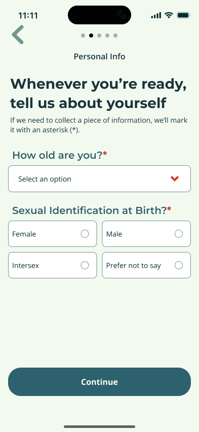


Conclusion
LUCI started as an onboarding project, but the more we spoke with users, the more it became clear that onboarding was only the surface of a much larger problem.
Many of the women we interviewed were not passive about their health. They researched symptoms, prepared questions, tracked changes, and tried to advocate for themselves. What they lacked was not motivation, but a proper system that helped them feel less alone and more prepared when healthcare became confusing.
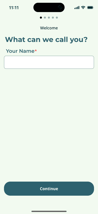
That shaped how I viewed the final design. A name field, a care plan selection screen, or an app icon may seem like small pieces on their own, but together they form a user’s first impression of whether LUCI feels trustworthy enough to keep using.
Seeing LUCI launch on the App Store with our onboarding direction and my own icon made this project especially rewarding. I'm proud of myself, and grateful that my teammates and I could design something to help those experiencing the tribulations of menopause.

To learn more about LUCI, check out their main website!