Introduction
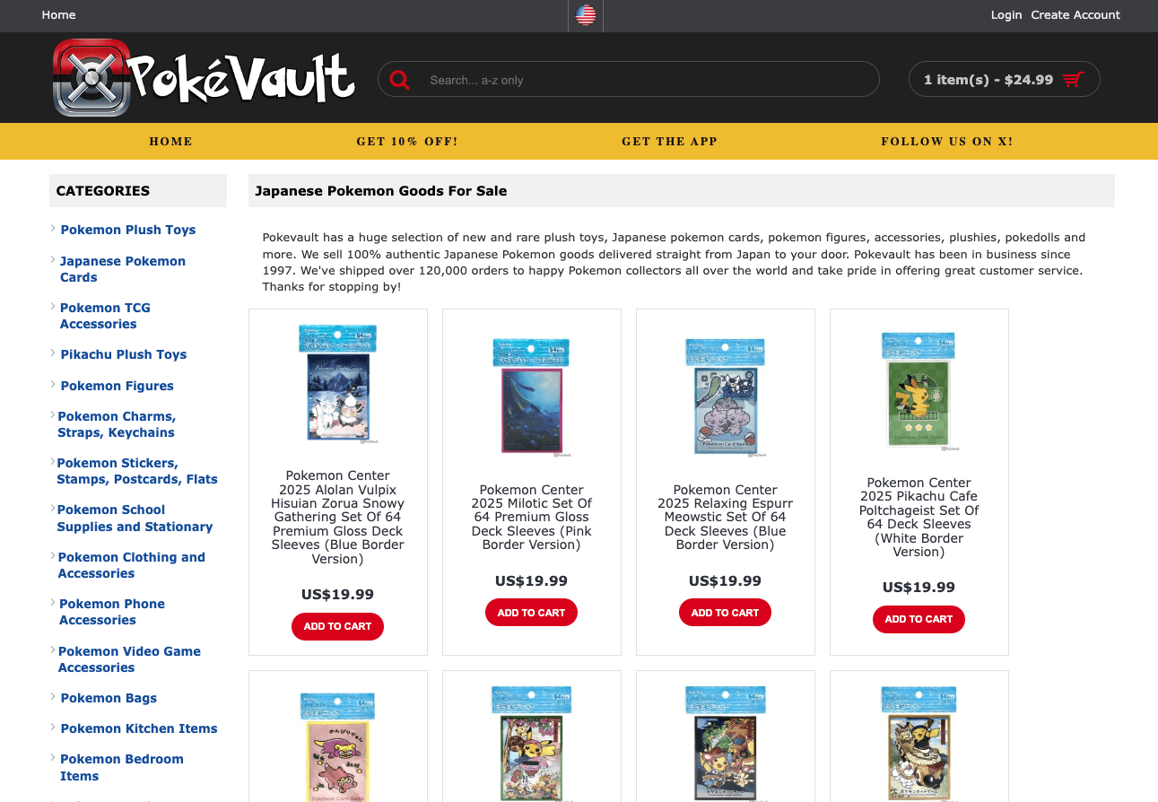
PokeVault is an online Pokemon merch website that has been selling authentic Pokemon merch since 1997. I chose to redesign this website because its confusing navigation and dated appearance detract from the credibility and authenticity it has built over the years
Process
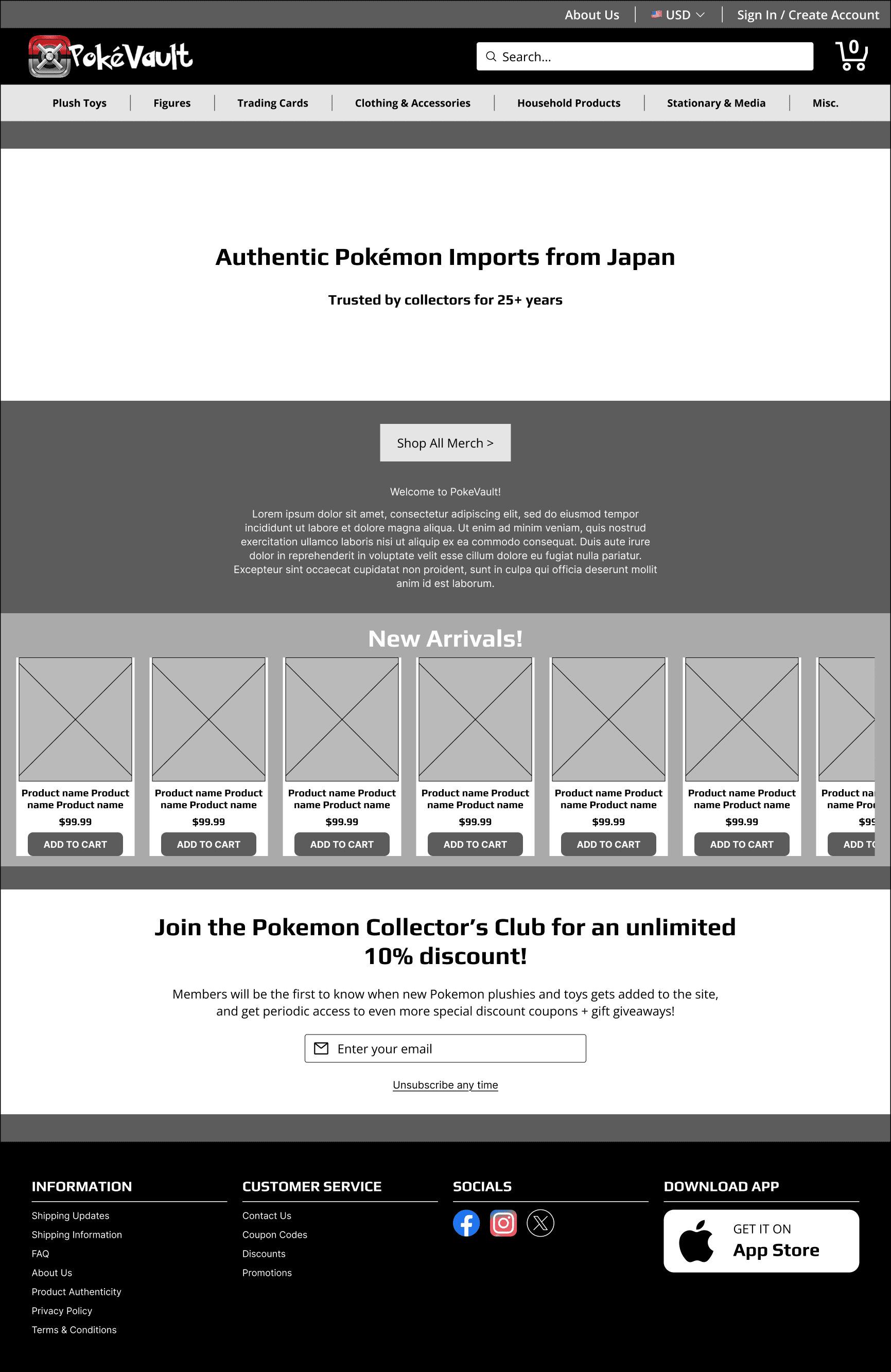
Original website home page as of 10/10/25:
Initial Main Issues:
“Real reviews” section is more off-putting than reassuring, due to the dates and lack of traceability.
Site navigation is not reflective of the user's position, or dynamic enough to reflect their chosen preferences.
The initial impression of the site and its typeface feel rather generic.
Design Process:
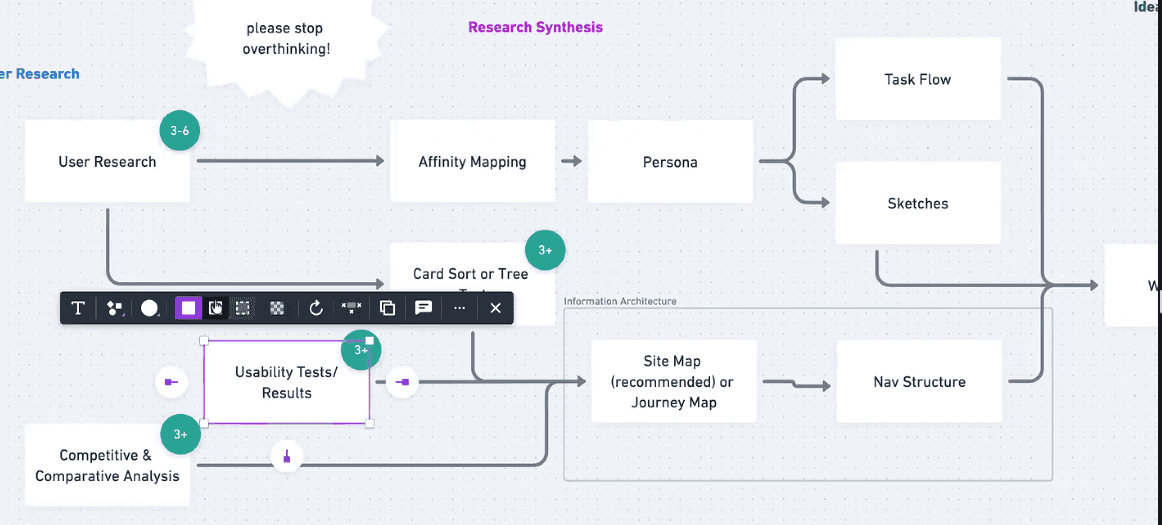
Methods & Deliverables
Interviews
Three total interviews were conducted. Two of my interviewees were my classmates, while the third was reached through one of their connections. I also had them perform a unit test of Pokevault’s current site (finding Pokemon merch they liked and then checking out).
My criteria for finding interviewees were as such:
You’re into Pokémon or have bought merch like cards, plushies, or figurines
You collect items from a favorite fandom (Pokémon, anime, games, etc.)
You’ve shopped online for fan merch or care about authenticity/limited editions
You enjoy browsing collectibles, even if you don’t always purchase them
It’s important to you that your collectibles are authentic/good quality
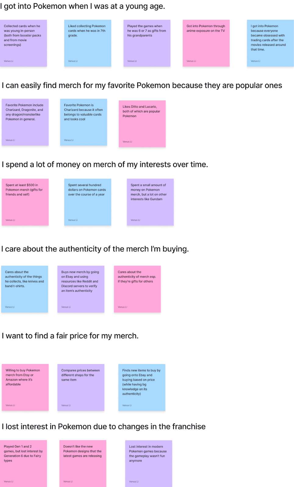
Affinity Mapping
Competitive Analysis:
I compared four other more popular online Pokemon merch stores to see which essential features PokeVault were missing, and what I could learn from their interfaces.
Link: Competitive Analysis
Persona:
From the results of my Affinity mapping, I created a persona who fit Pokevault’s target audience and derived a problem statement to help further guide my ideation:
“Tom is a long-time Pokemon fan whose love for Zorua has persisted into adulthood, and needs a reliable way to continue collecting authentic Zorua merchandise. However, while he is willing to shop from niche specialty stores outside of Amazon or Etsy, he often finds their interfaces outdated and lacking the visual reassurance and clarity he needs to feel confident in the purchase. Tom needs a trustworthy, easy-to-navigate website that clearly communicates product authenticity and accurate details so he can buy with confidence.”
Link: Persona and Problem Statement
Card Sort and Sitemap:
I had a group of volunteers sort a variety of items that I picked out of each of Pokevault’s many categories. The sheer number made it hard for users to figure out where to start, and I needed opinions on how to simplify them to a reasonable degree.
Link: Card Sort
Once I was confident on how I could resolve the categories into larger umbrellas with precise filters, I made a Sitemap showing exactly what the directory looked like. The Task Flow is also included.
Link: Site map and Task flow
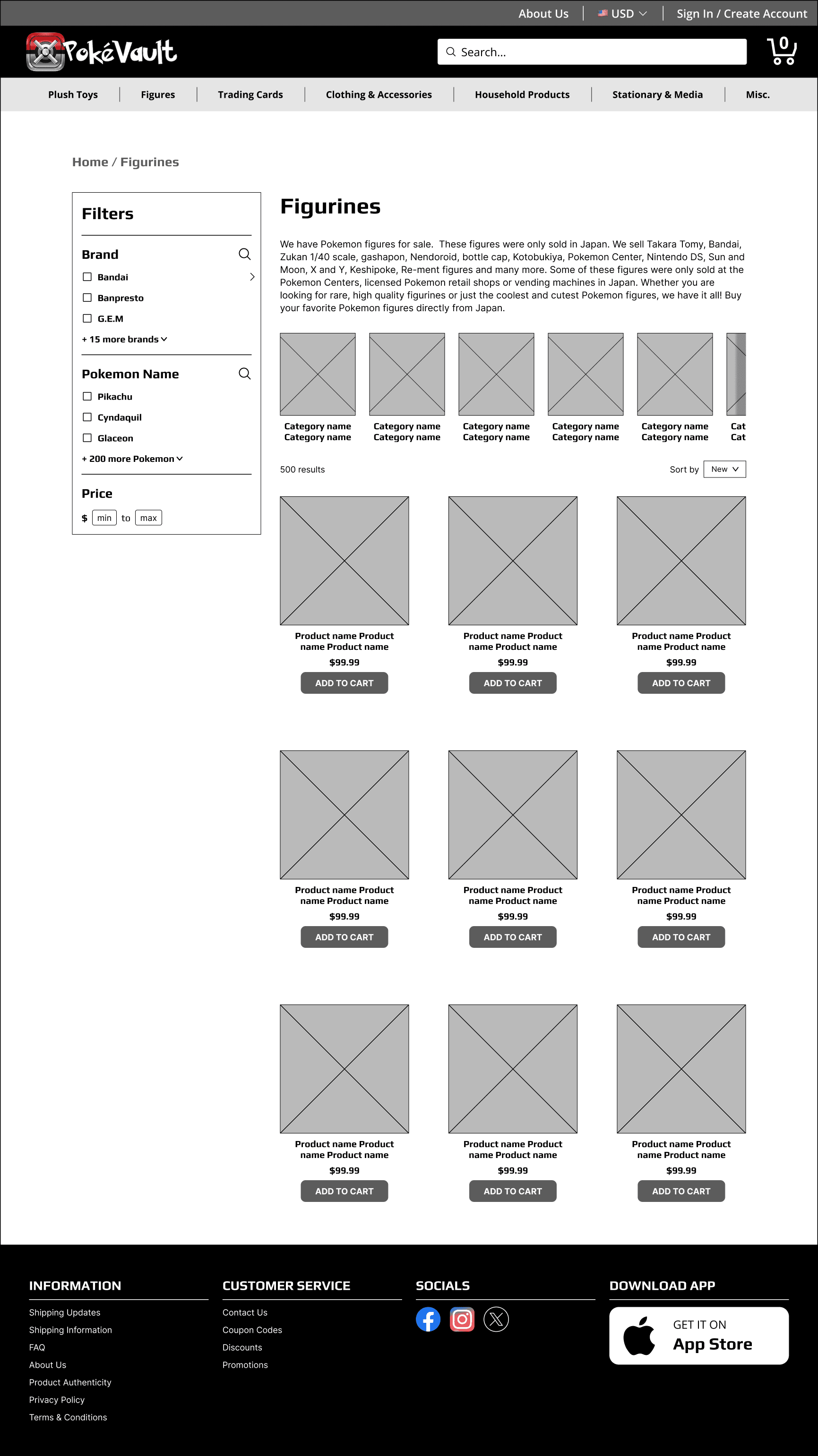
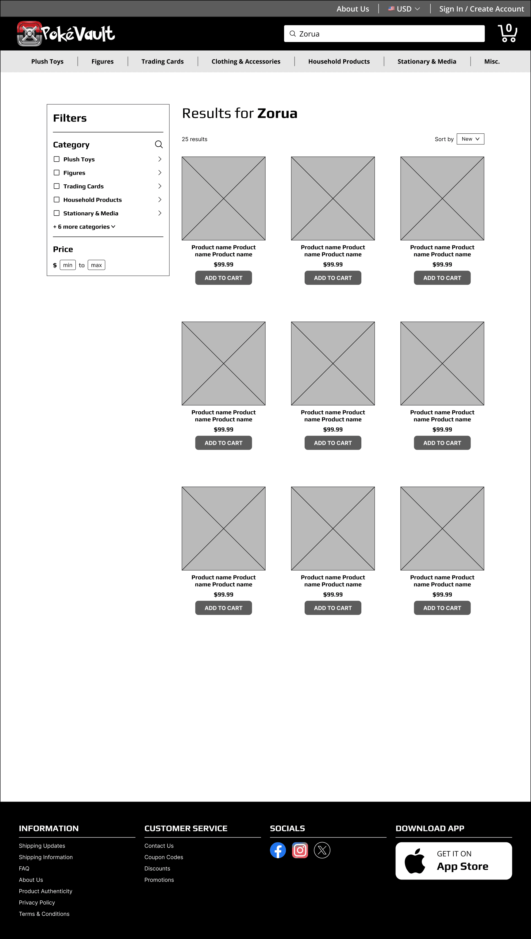
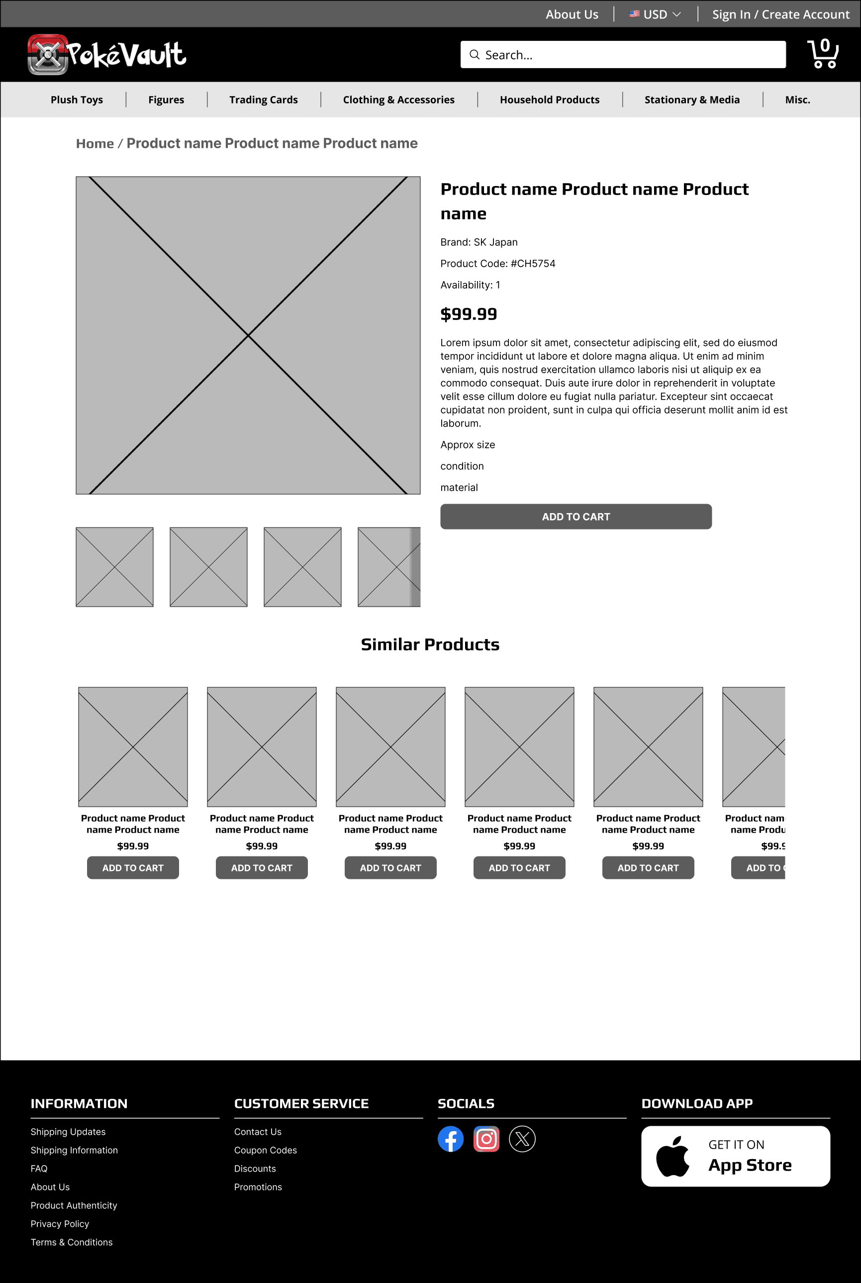
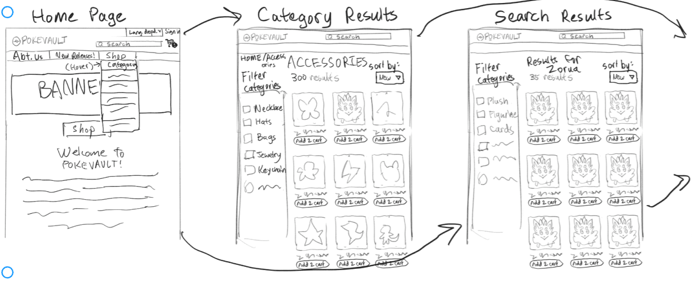
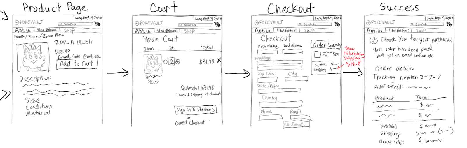
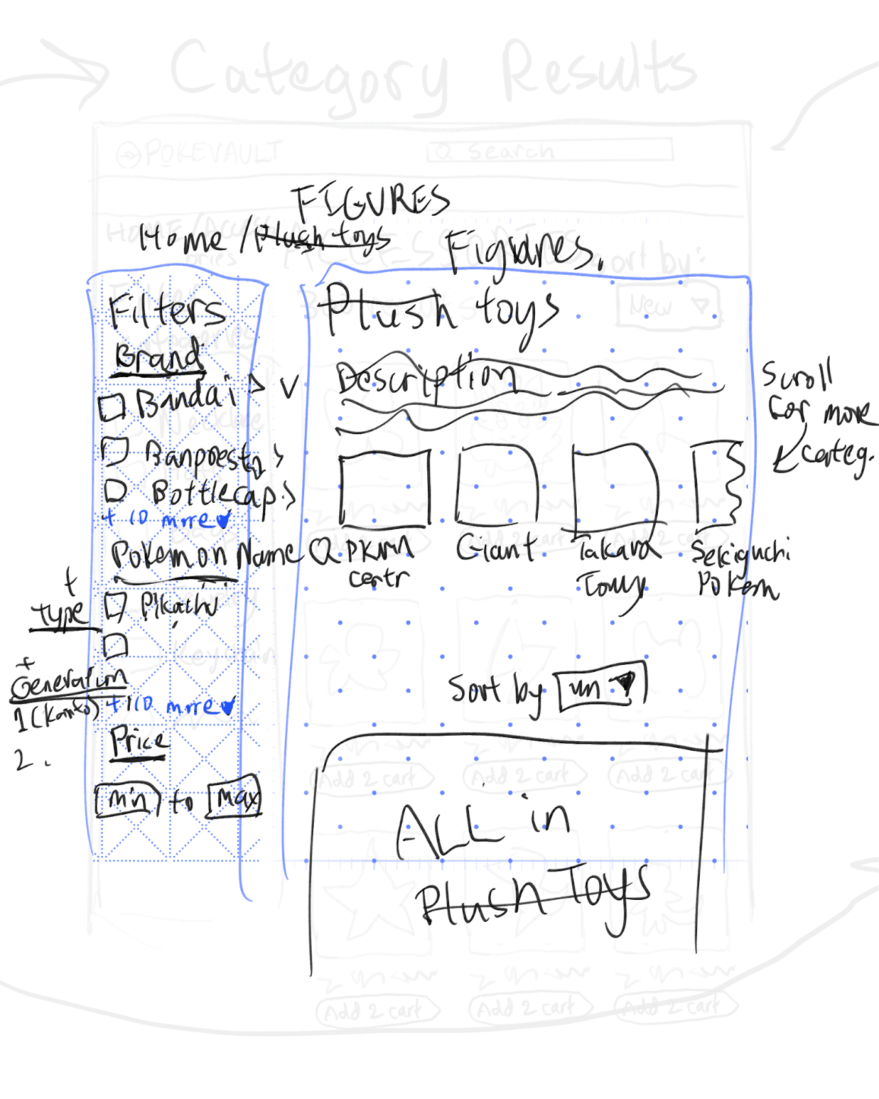
Sketches:
In total, I made sketches of seven pages that I would redesign. I took strong inspiration from the newer e-commerce interfaces, but incorporated them in a way that wouldn’t feel too out of place on a site like PokeVault.
Home
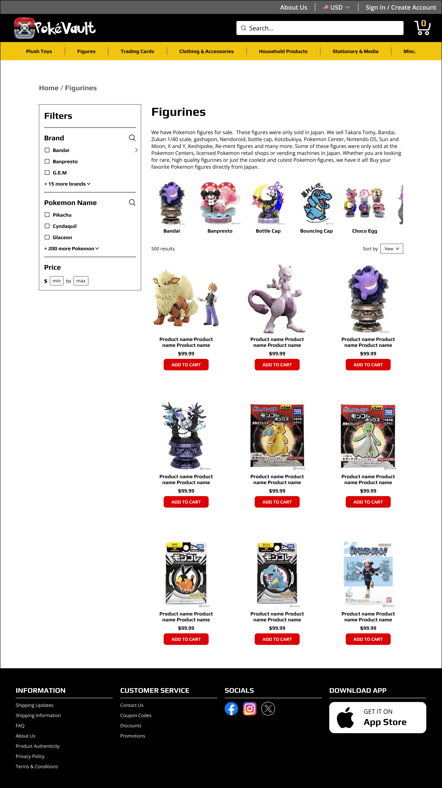
Category results
Search results
Product description page
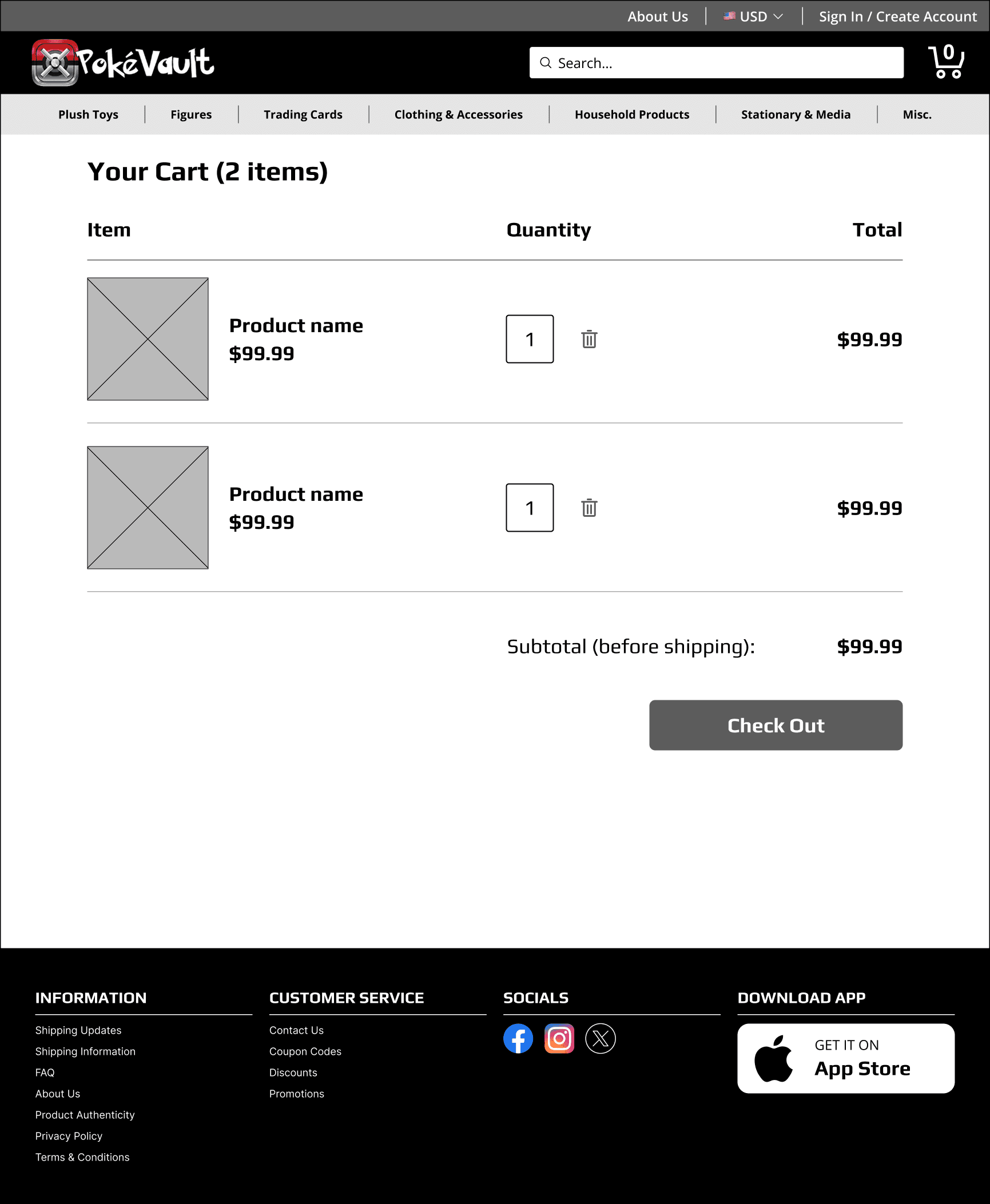
Cart
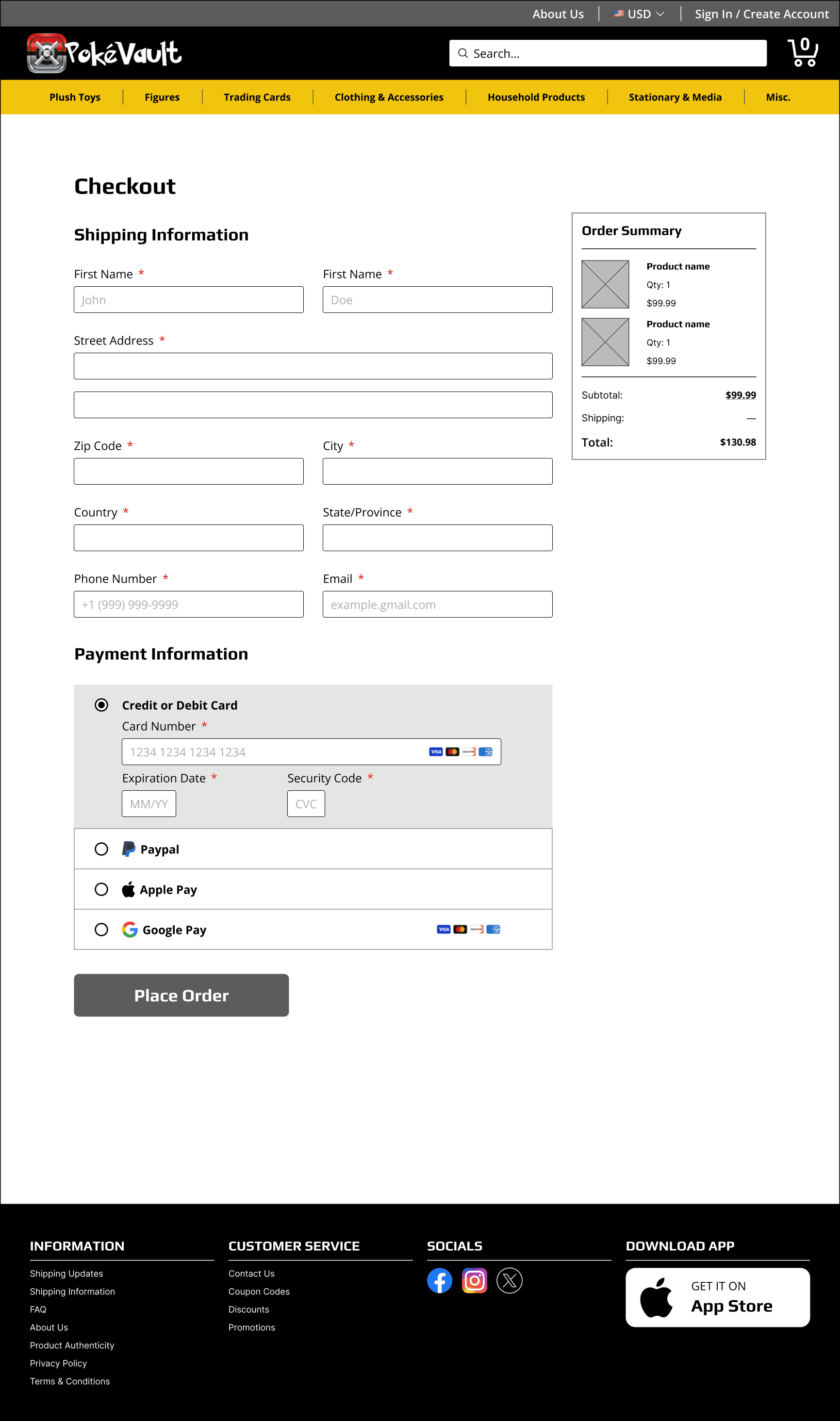
Checkout
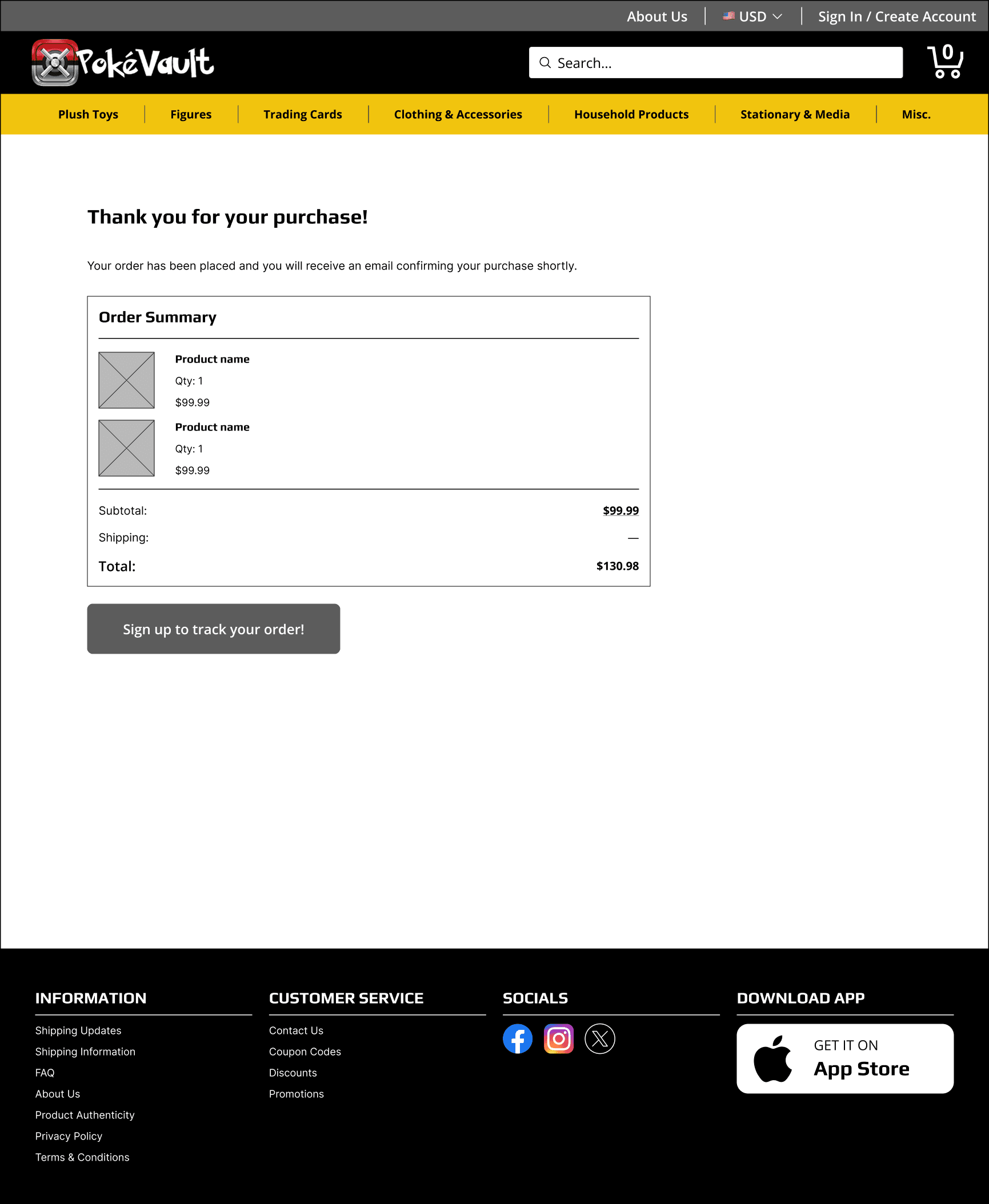
Success
Wireframes: